
How Do You Do..?
The past three years or so I've changed the way in which I make my drawings. I still draw with a pencil (a technical drawing pencil - handy not to have to sharpen it) and ink with a brush, but I've added a few extra steps, which have really helped to improve my work. I'm happier with it, in any event. I obviously have lots of room for more improvement - and practicing all the time is probably more the reason I'm happier with my work, of course - but there are a couple little things I've been doing that seem to help, too.
- When I draw, I'm always holding my paper up to the light and looking at the reverse. Like when I was a teenager and my art teacher told me to hold a picture up to the mirror. I found the mirror-thing a little distorted to be of much use, but perhaps I just didn't know what I was looking for. It's just amazing how the mistakes - poor proportions, slanting, crookedness -how obvious they can become when viewing a sketch in reverse.
- I correct what I see is wrong and finish the sketch. Well, almost - some things I'll leave, even though I know they're wrong. Things like a hand that's too big, but drawn perhaps nicely enough. Or a finished head that's not quite resting straight on the neck. Or that the entire figure is slanted to the left or right. For these large alterations, I use the computer.
- Scanning the sketch, the first thing I do is reverse it. Even more so than viewing the paper in reverse, seeing it mirrored on the computer screen seems to make mistakes even more obvious. And then things like reducing a hand or two, or straightening a head or figure - these things are very simple to remedy in your graphic program. And I learn from it, too, of course. I see what's wrong and how to fix it - and try not to make that mistake again. I often do repeat it, though, but gradually my sketches are improving.
- An example. Here is a sketch I've scanned, with the reverse to the right:
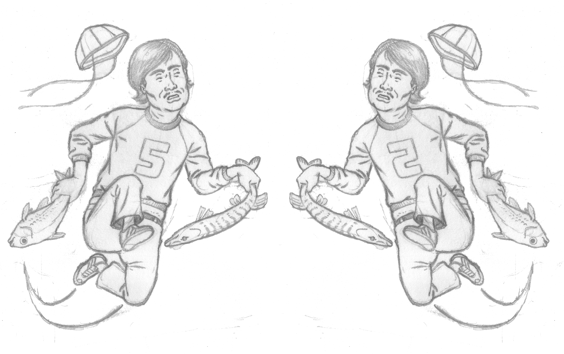
Looking at the mirror-image, I wasn't too displeased with the drawing. The fellow's head is a little off centre, maybe, and his eyes are a tad un-level. His one shoulder bothers me a bit. And for my taste, the head of the pike is too close to the man's body, the "5" on his sweatshirt is too near his knee and his rear leg is too close to his bum. These tangents, as they are called, make things look a little busy, they detract from the total image and form shapes/connections that were not intended. I also didn't like the speed-line behind him.
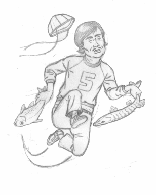
- Using Corel Photopaint I adjusted the sketch. I should have maybe fixed a hand too - they're not quite the same size, but I have actually just noticed it now (and in a week I'll probably see lots more I should have changed that I just don't notice now). Here is a Gif showing the changes:
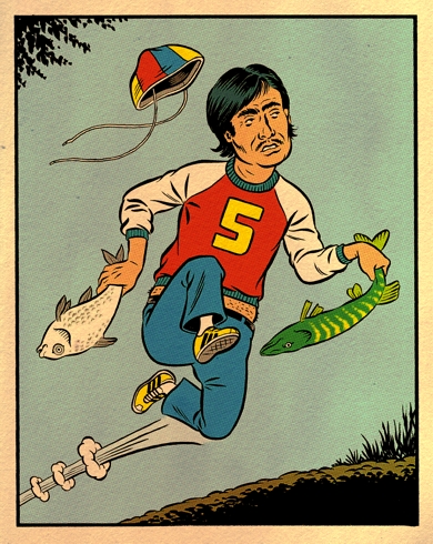
I then print out the sketch, slightly bigger and in cyan, on Bristol paper and ink it with my brush. Scanning it in, I then colour it nice and simple and, for the fun, add a little "aging-effect":
In a day or two, I'd like to show another example, and perhaps talk about my ideas about colouring and even make a quick film of a cartoon being inked. Sounds like a grand time! Yes, just grand.
Geen opmerkingen:
Een reactie posten